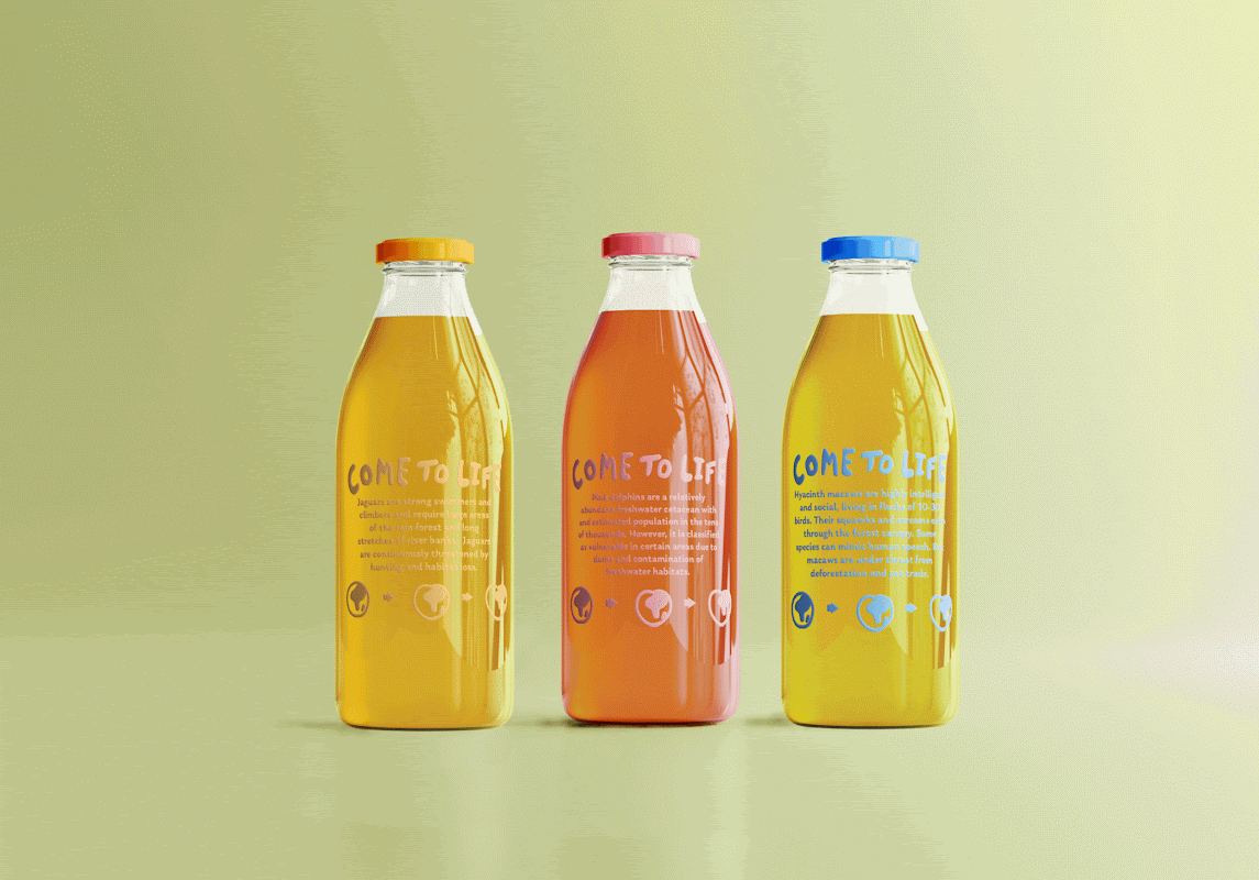
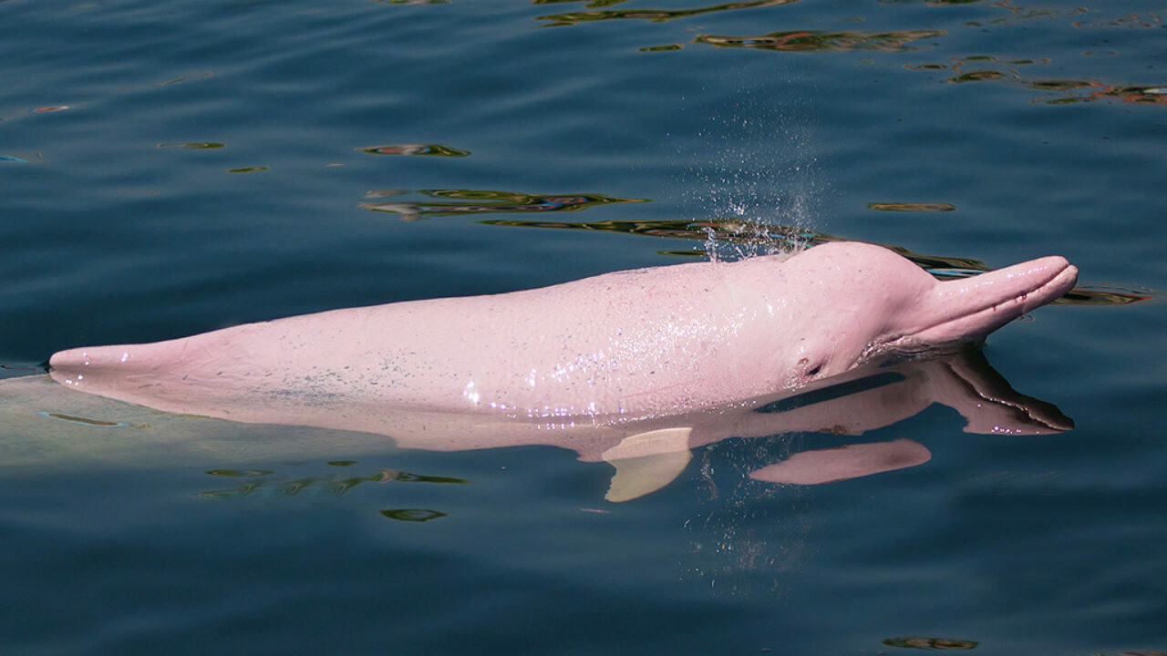
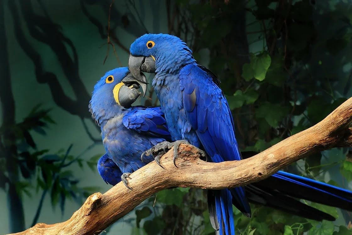
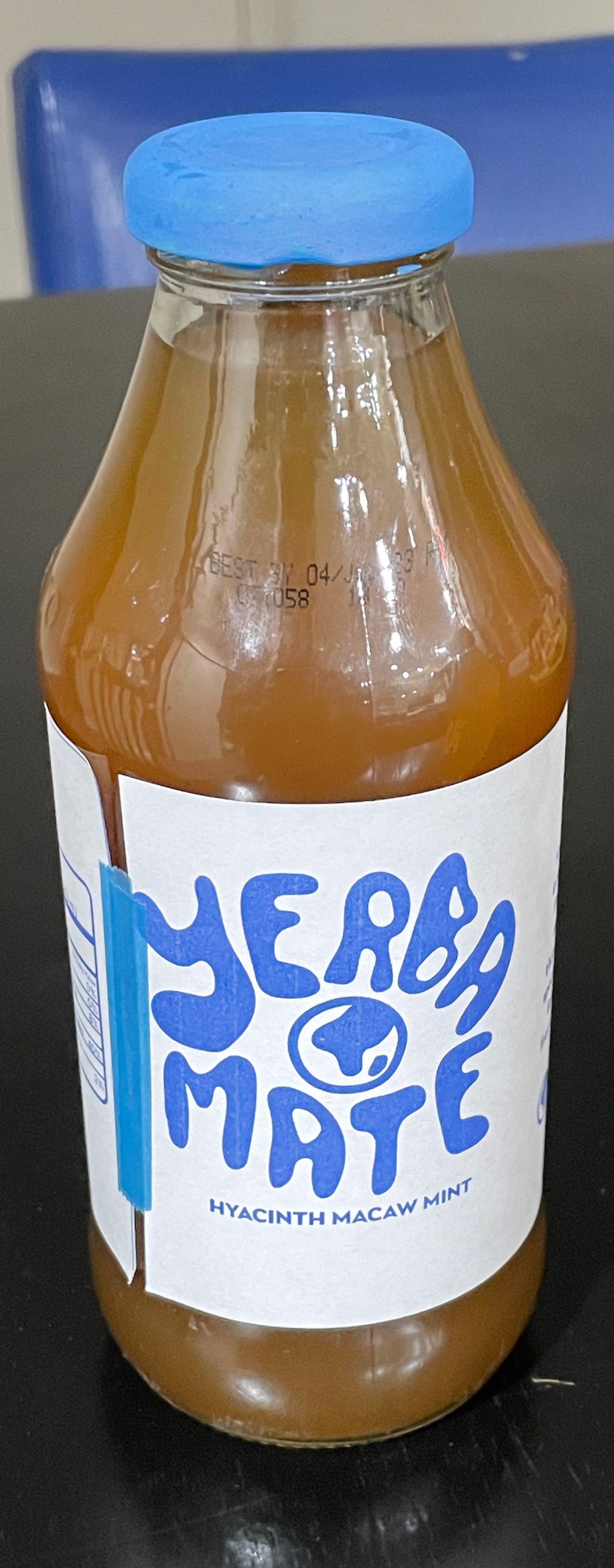
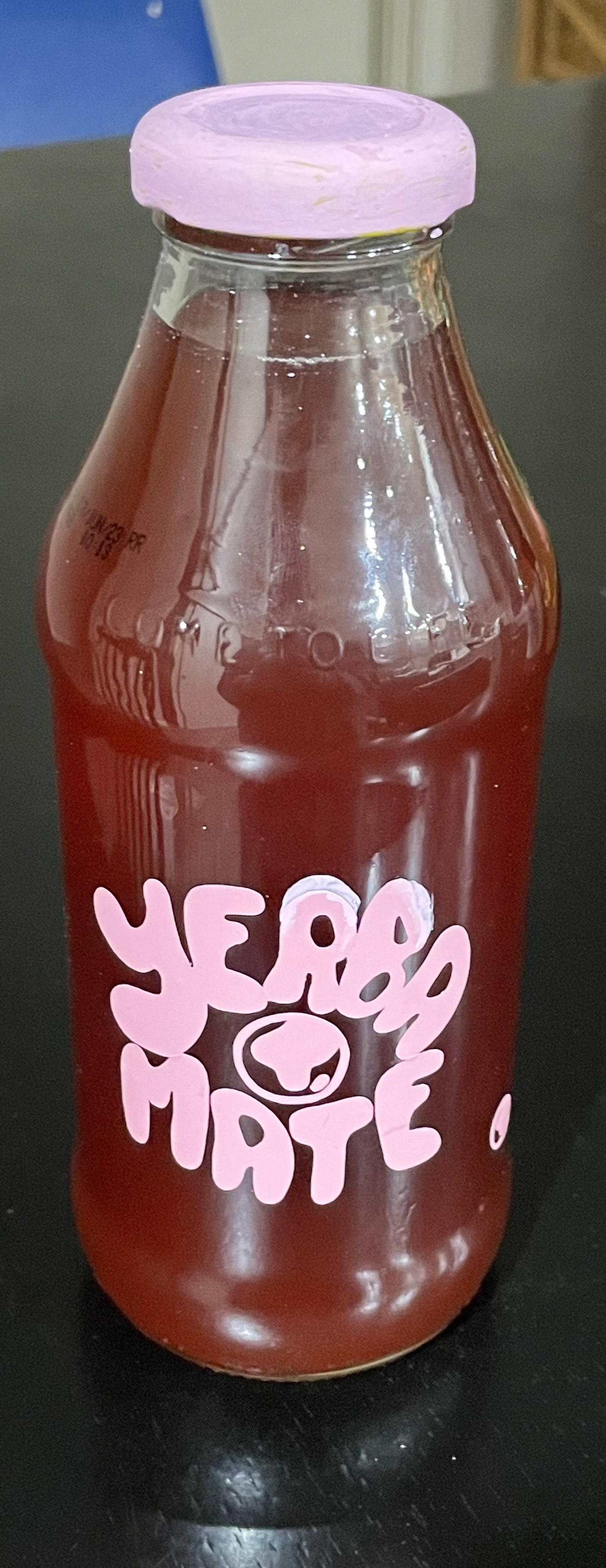
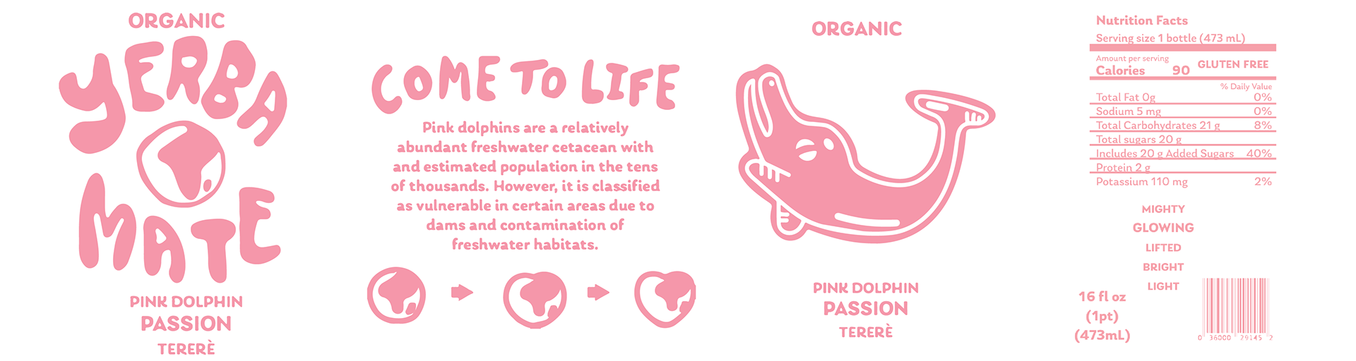
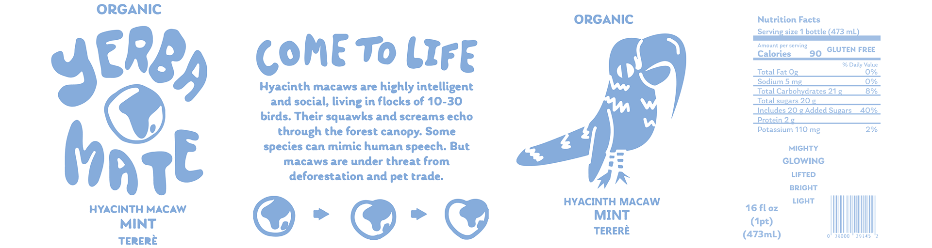
Every third Friday in May is endangered species day. The Amazon houses yerba mate and endangered species like the Onca Panther, Pink Dolphin, and Hyacinth Macaw.
Product, audience and competitive research
Yerba mate is a dietary supplement farmed in the Amazon amongst other yerba mate competitors. Through research of other yerba mate brands, I found an abundance of information linking the origin of those drinks to the Amazon.
Therefore, a branding collaboration to display endangered species that are on the verge of extinction in the Amazon would be a substantial effort towards raising awareness for endangered species. The display of this information on a product that is farmed in the Amazon opens the possibility of making a difference for endangered species, because something from the Amazon is in your hands. This awareness and realization that change is possible could potentially increase efforts to rehabilitate the environments where these species could thrive and build new generations.
The target audience for this mate is anyone whose eye can be caught by the bright colorful shift in branding. This highlights the category of younger consumers, which will successfully raise awareness to the next generation and on. Consumers who love animals, healthy alternatives, and making a difference are the target audience.
Influence and reference images
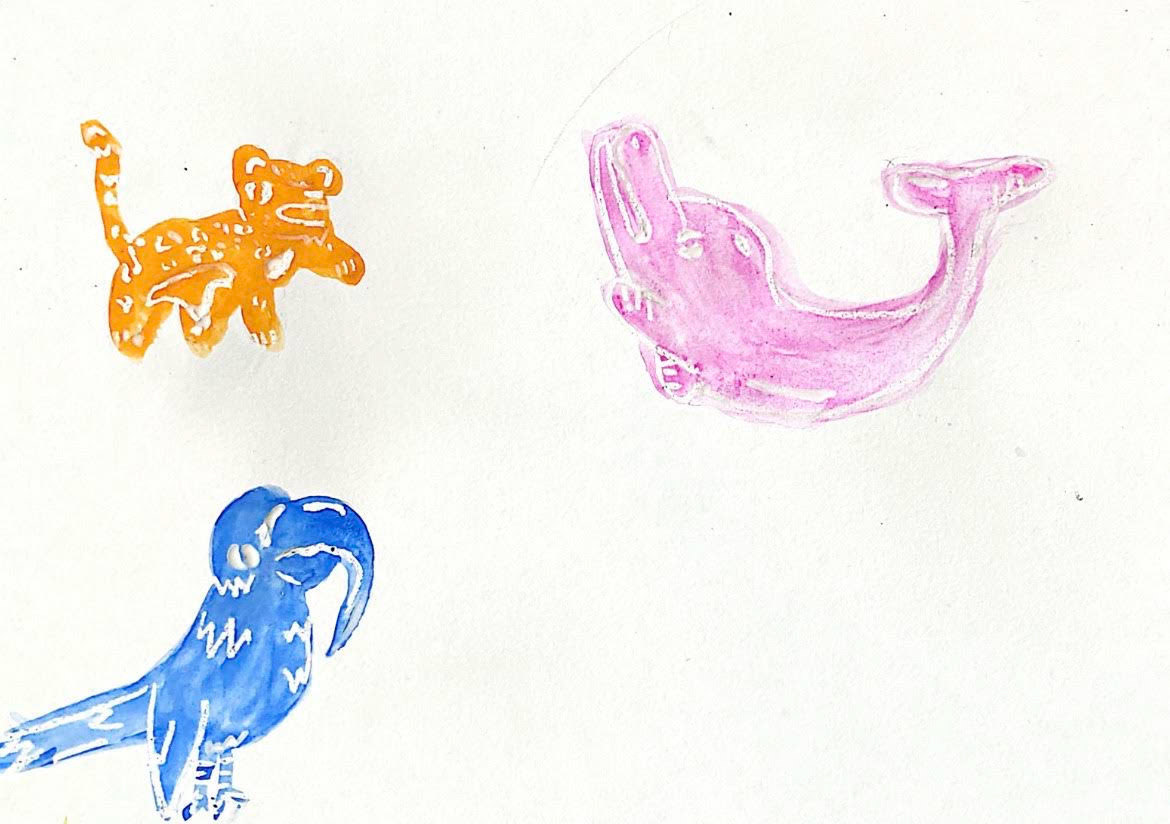
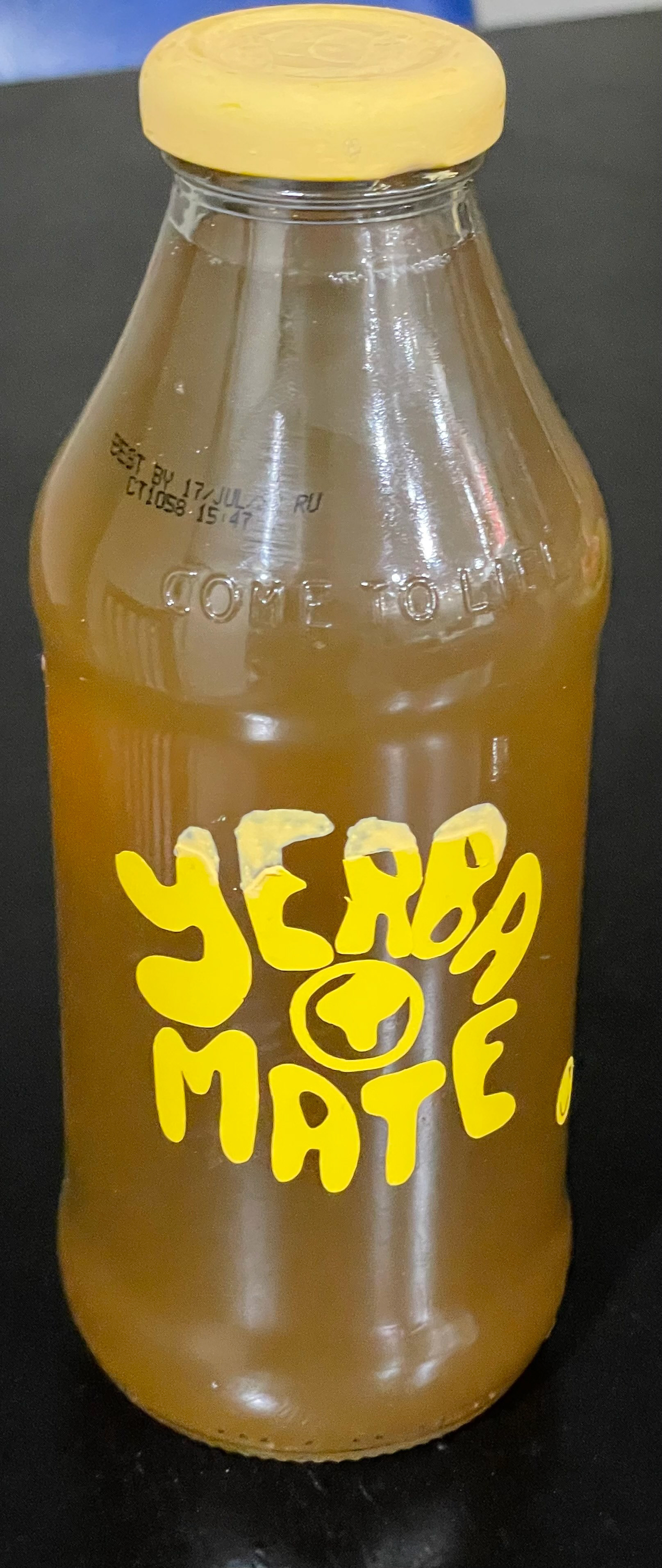
I took influence from current endangered species in the Amazon. The three animals I chose where the Onca Panther, Pink Dolphin, and Hyacinth Macaw. These animals are currently combating extinction in the Amazon.

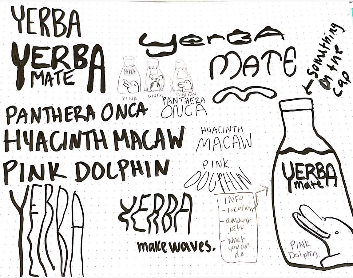
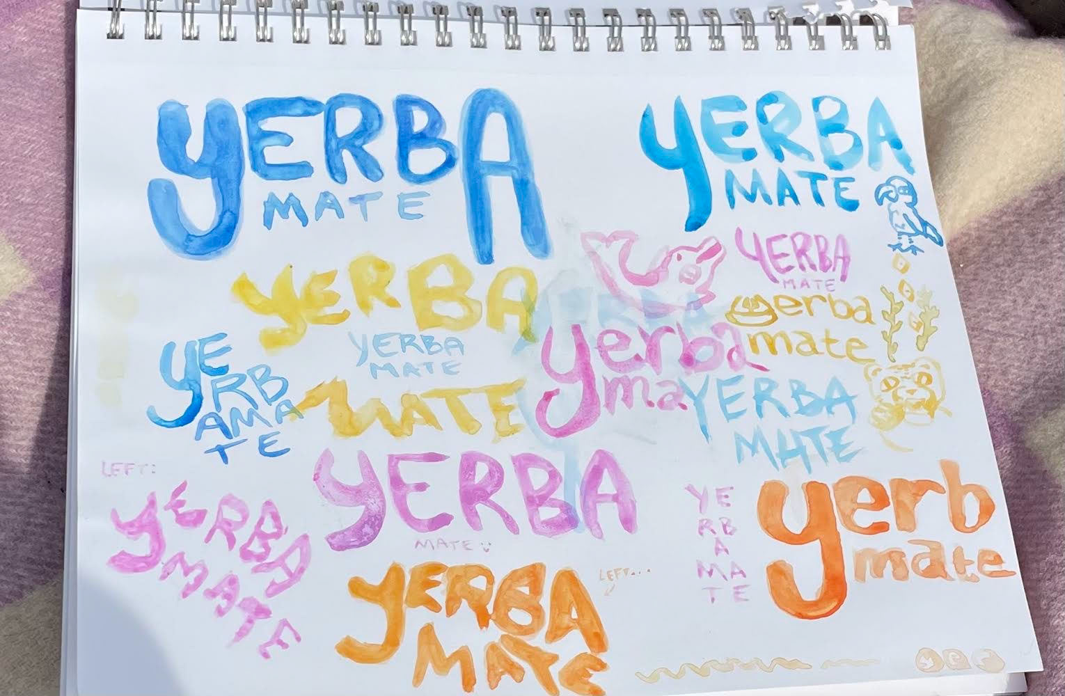
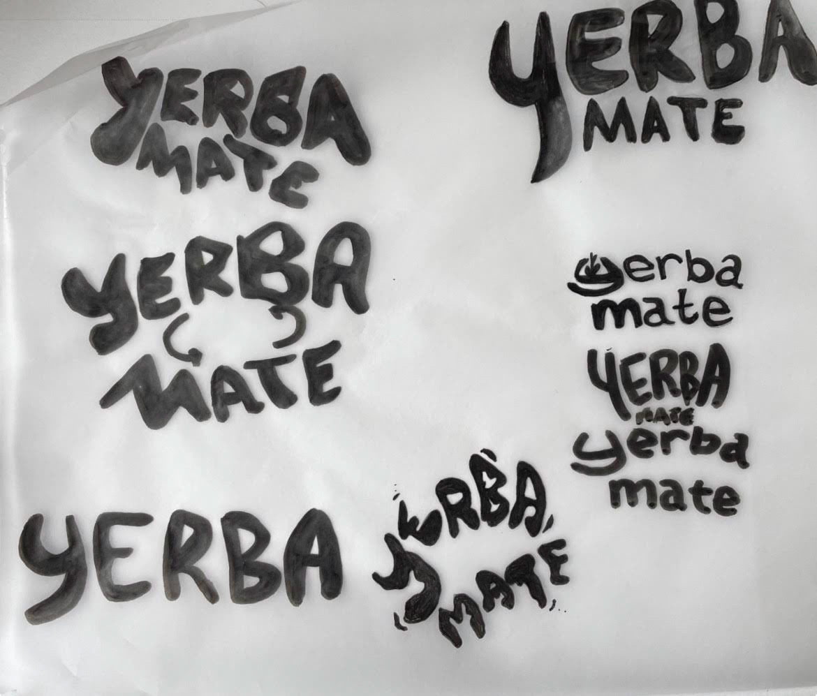
Sketches
Developing an organic type was a focus of mine when iterating this concept. I stepped outside of my comfort zone and did some experimenting with using my non-dominant hand to design. This was a fun new process to explore that yielded some great new forms to develop from. If you haven't tried sketching with you r non-dominant hand, I recommend it to expand your line and type quality capabilities.

Initial concepts

Non-dominant hand type exploration
Animal concept iteration

Quick sketch exercise
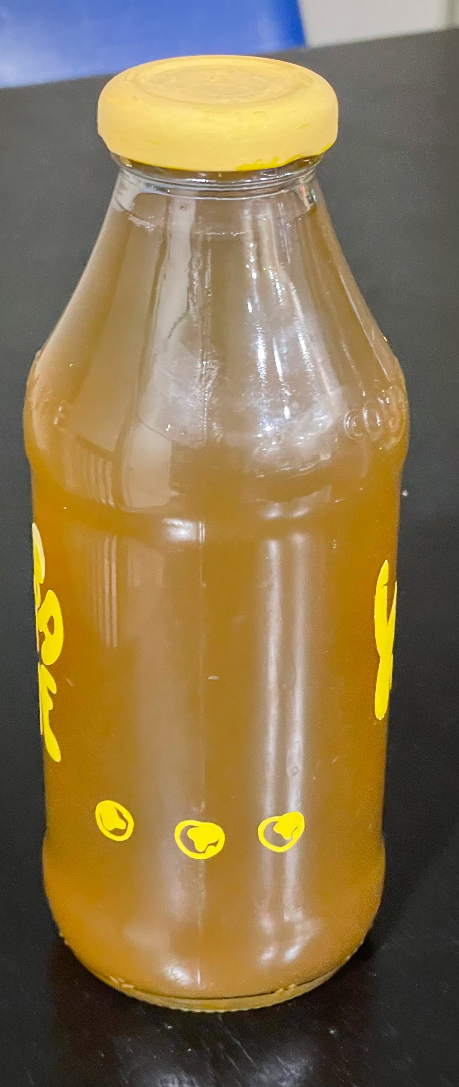
I then transitioned to using watercolor to create some fluid type and illustration forms. The end logo mark was developed from a very shaky left-handed type experiment. You may be able to pick it out, it is the largest yellow type mark. I then iterated these forms and refined them.
Preliminary Prototypes
I began by printing a paper version of the design to figure out the spacing of how I would like the vinyl to be placed. The next round was done in vinyl and was found to go shockingly smooth except for the impossibility that is weeding small type. The last iteration fell flat when the blade became too dull and failed me on a few cuts. Overall, from this iteration I learned how much time follows creating vinyl designs, how much vinyl you unintentionally waste, and how sizing would differ based on cut allowances for the design.


Iterations
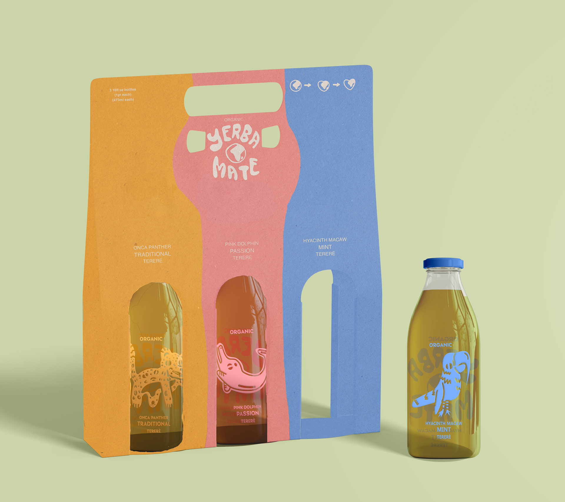
I then took a step into developing a dyeline for a pack of 3 bottles. I was surprised to find that there are not very many design solutions currently out there for holding a three pack of bottles. So initially I worked to solve that problem. However, time did not allow for these concepts to completely develop. In the future I would love to further resolve the box form.
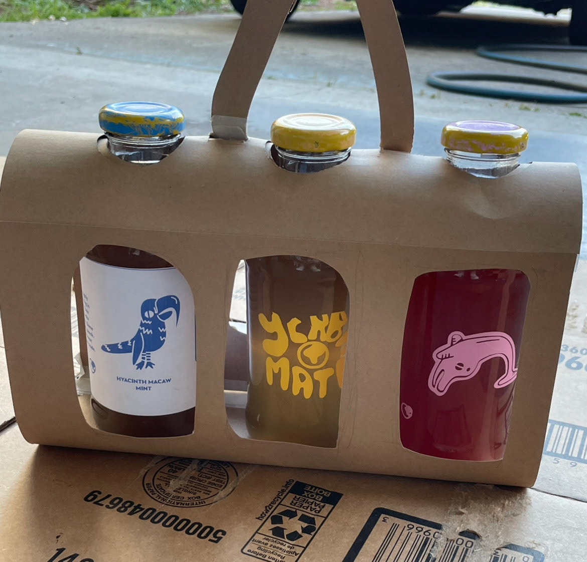


Product label and package design flats
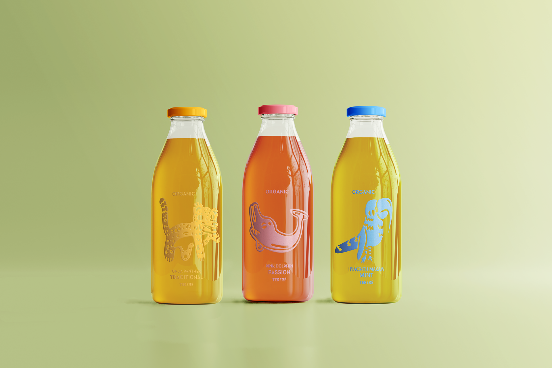
By the end of this project, I found myself tight on time, materials, and energy. This is what lead to using mockups to display my designs. I found many positive aspects to this design decision, as it led to developing colors based off of aesthetic rather than materials, I had the opportunity to create a small animation to portray each of the sides, and I was able to explore more of photoshop and expand my skills.

My hopes and wishes for the future of this project is to attack vinyl once again, in a more material saving and efficient way, and refine the box concept dyeline.
Final