The Brass Moose is a rejuvenated 90's style charmer turned modern desert retreat vacation home.
This stunning urban escape is ideal for couples, good friends, and adult families.
I had the pleasure of putting a brand to this refreshed home.
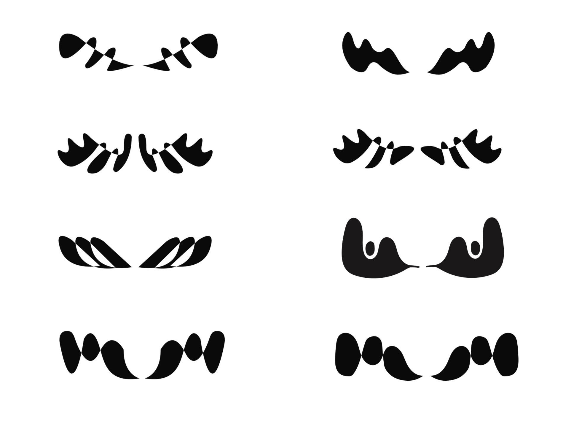
In order to brainstorm what The Brass Moose really looks like, I drew a lot of moose.
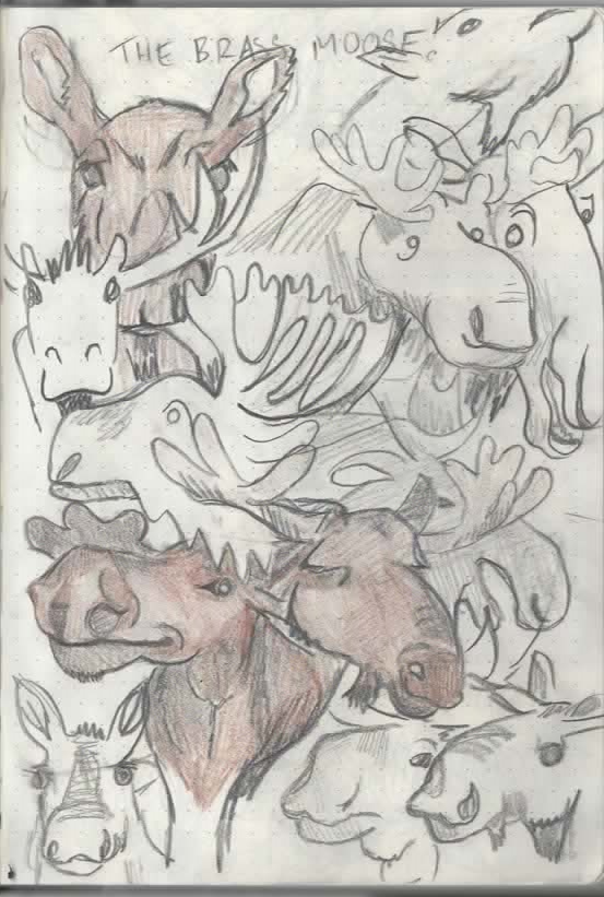
I then developed 10 sketches for the client.

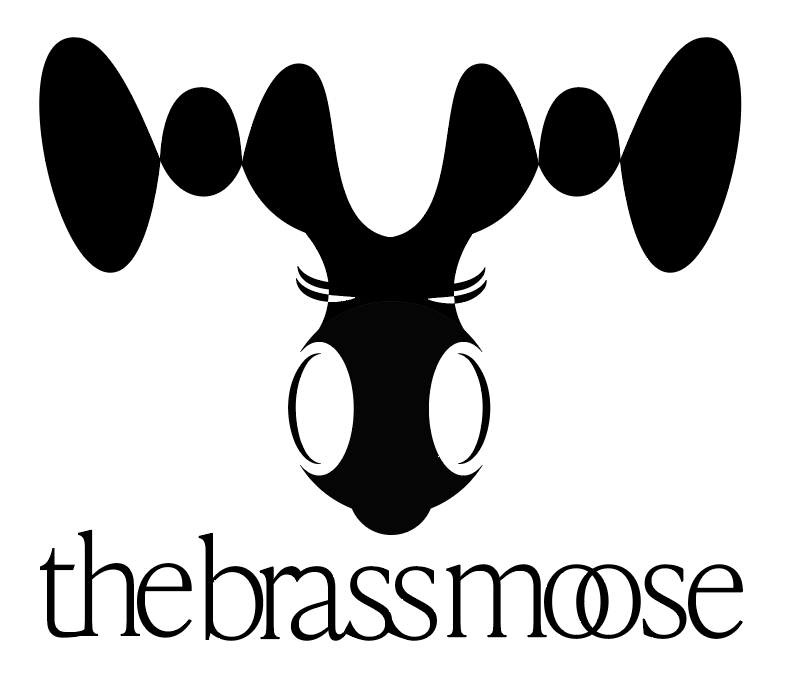
She liked figure 1 and asked for a full face with black and white contrast in mind.
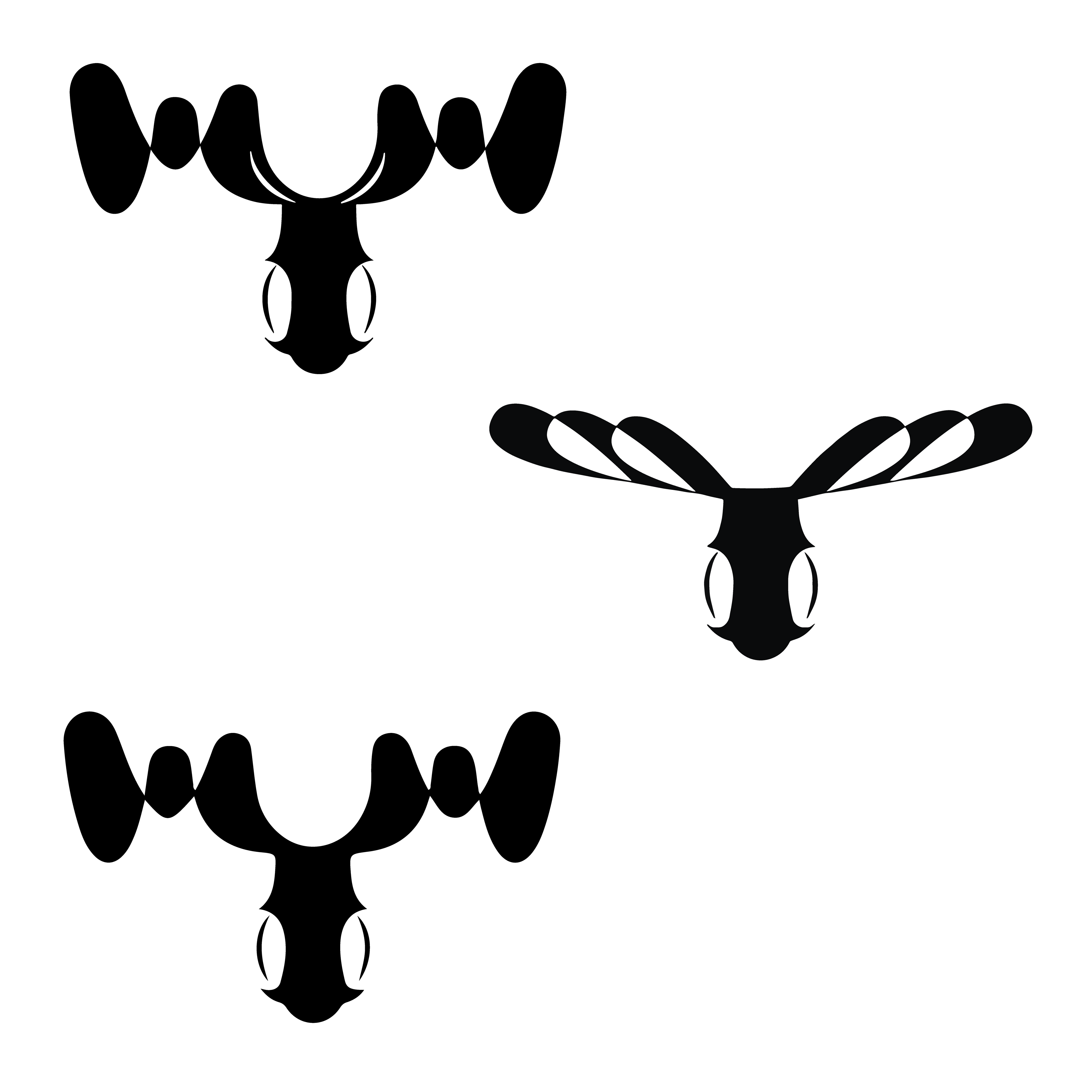
From there I digitally sketched these guys.
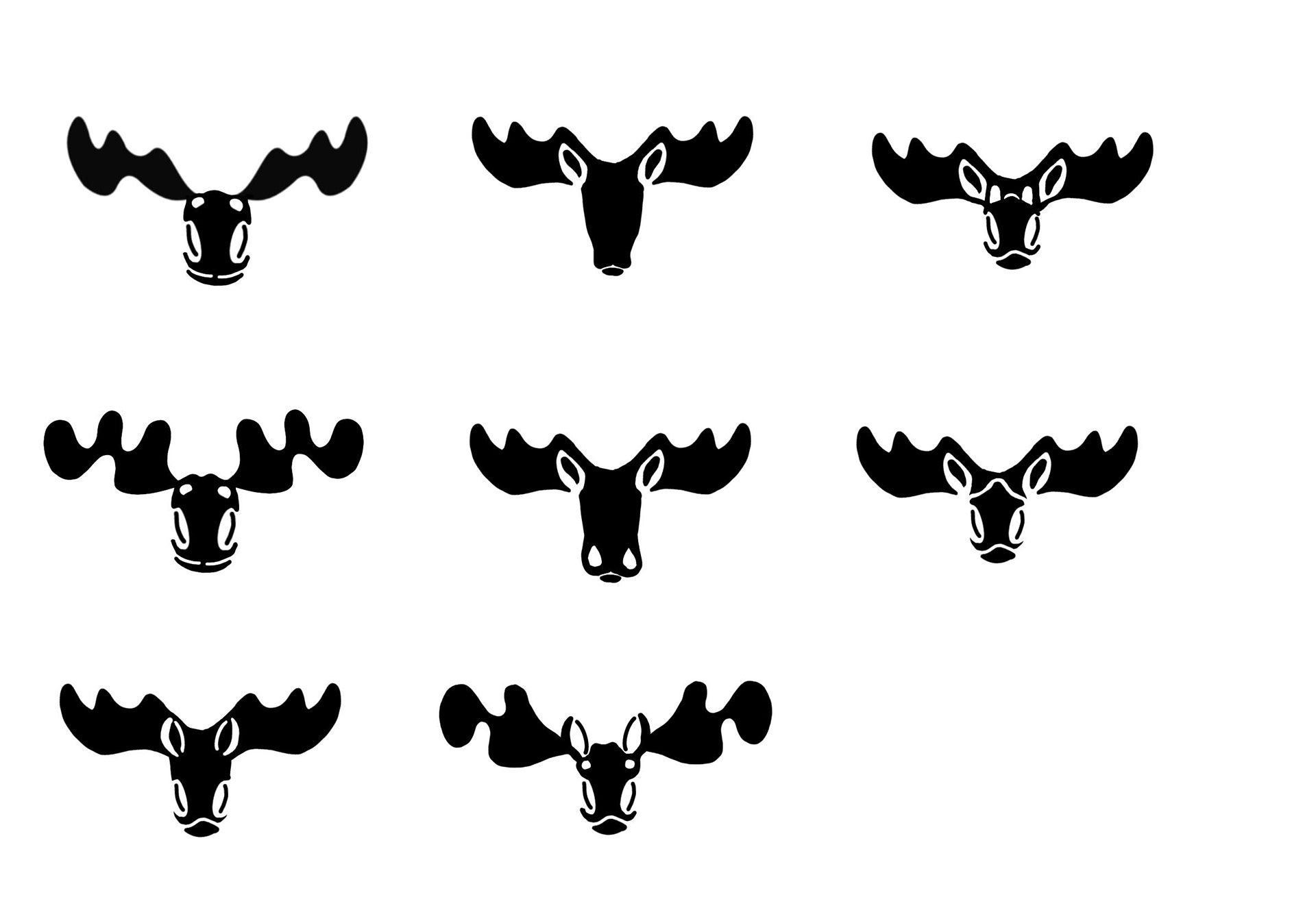
She loved figures 2 and 6, but the antlers need more iteration.
I vectored a few antler options for her.
She liked figures 5 and 8.
I scratched a quick idea of what those would look like together and got her final
options together.
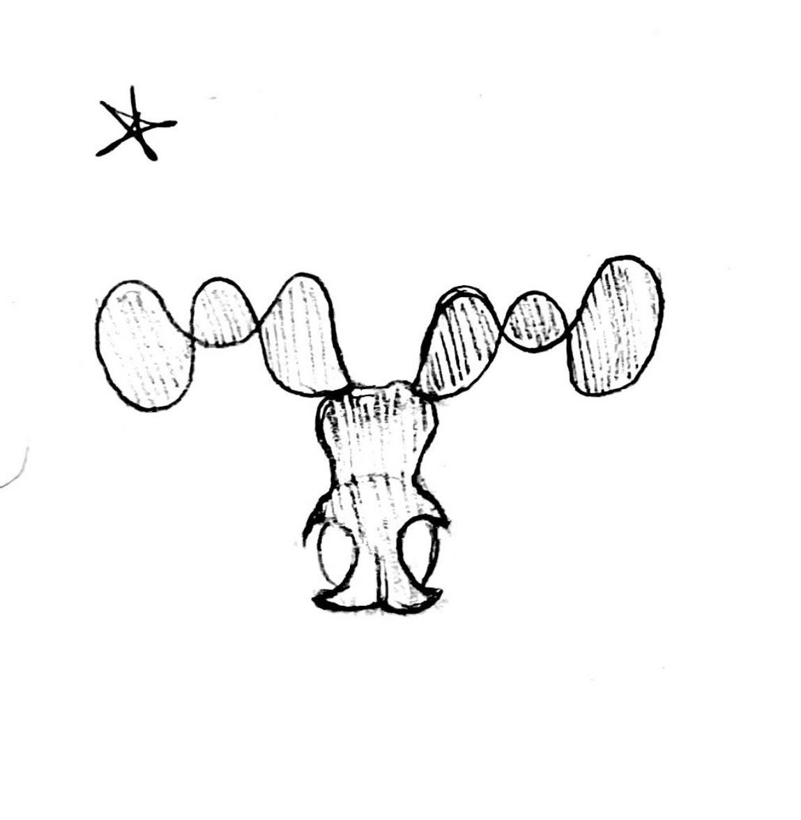
She fell in love with figure 3, but it's missing something.
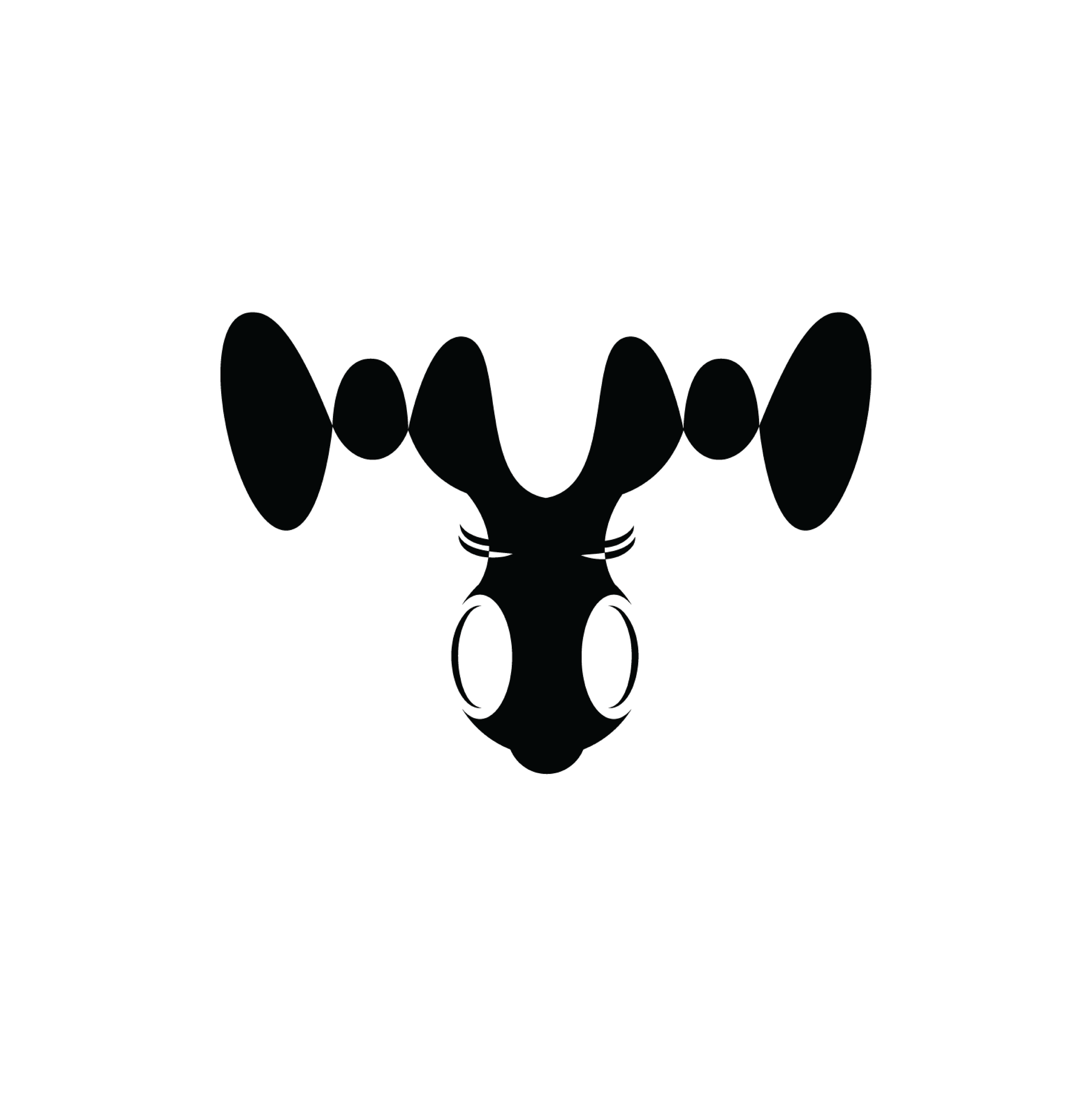
Eyelashes.
Next I gathered a few type options. The client requested tightly kerned type with
linking "O"s.

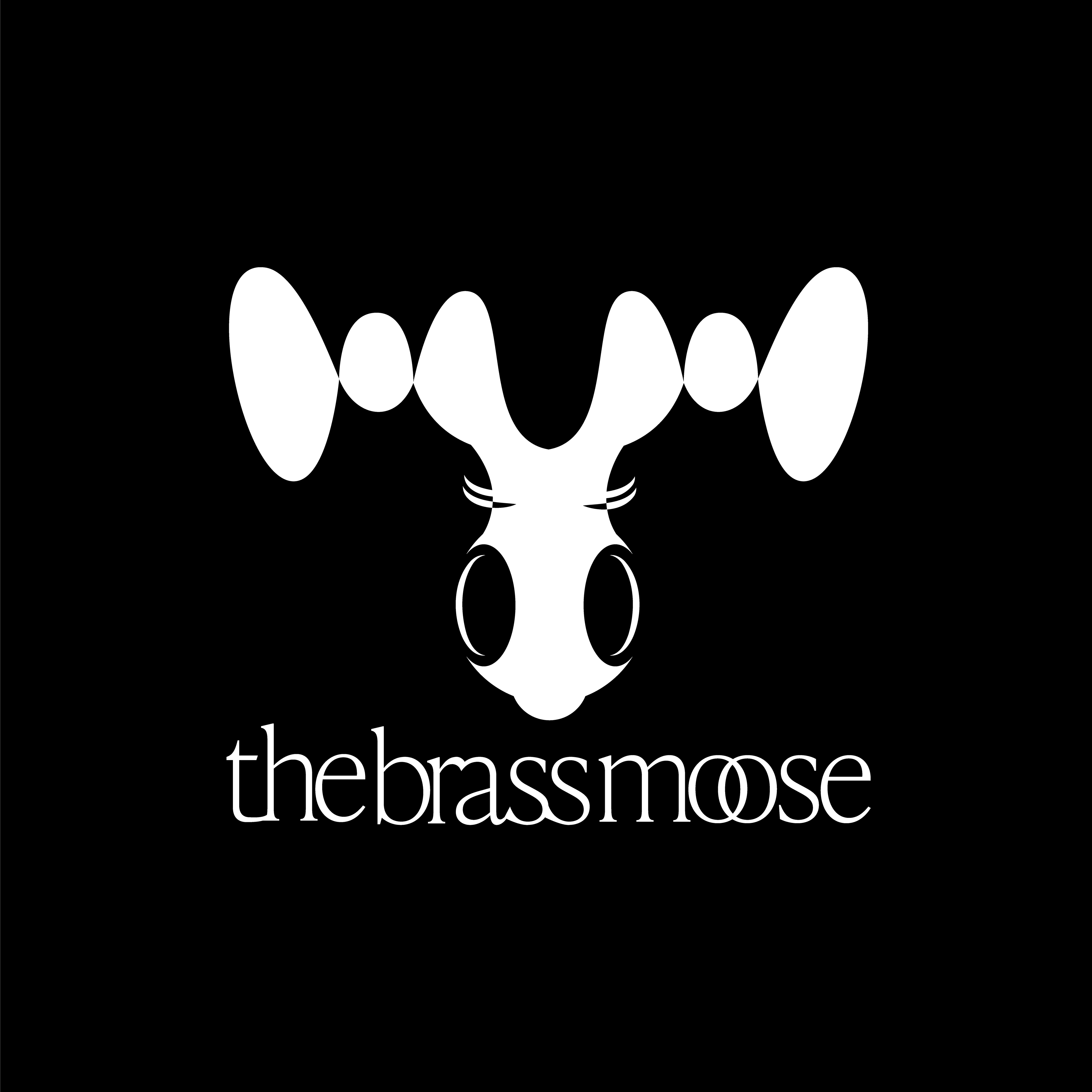
Ultimately she landed on figure 2 as the logo for The Brass Moose.
Time to apply it to socials.
The client asked for a dark theme that makes the pictures of the home pop.
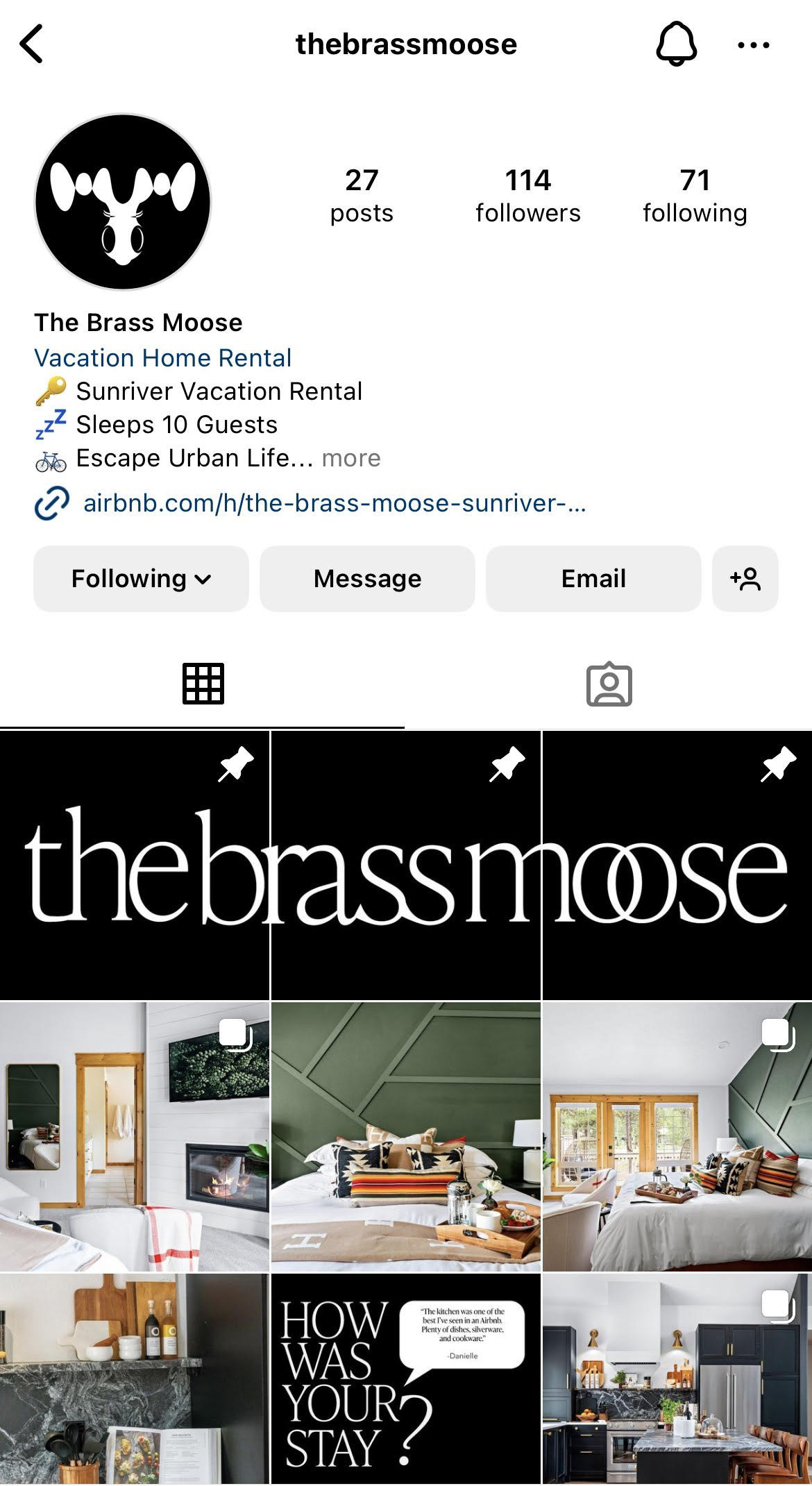
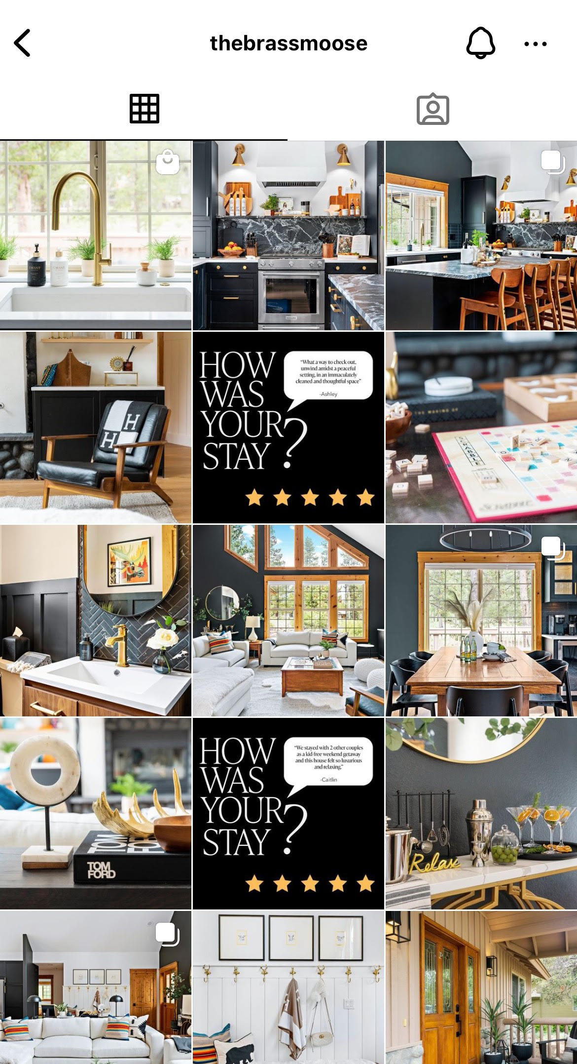
I created a type spread over 3 posts to pin to the top of the page and set the theme.
From there I maintained a posting format with what photos the client gave me and used a filter to make all the photos feel like they exist in the same world.
When displaying a vacation rental it is vital to not only catch the best angles of the home, but hear others feedback who have visited the home.
So, every 5 posts I include a customer's review.
That keeps viewers informed and helps the Instagram feed feed cohesive.
Take a look on Instagram: